Whispering elegance: Quiet Luxury applied to graphic design
Elegance is key, and one of the most intriguing words when you stop to think about it.
Elegance is one of the most intriguing words when you stop to think about it. Elegance shares the same root with to elect, in Latin:
ēlĭgo: to pick out, choose, elect.
With that in mind, it's easier to build something that is perceived as elegant: it needs to be intentional in every part while expressing a natural obsession with detail. It can't seem forced, that you're trying too hard, but chosen.
In the recent edition, where we delved into the subject of Quiet Luxury. If (we squeeze it enough) we're going to get the thought-provoking part of quiet luxury, it has everything to do with the word elegance. Intentionality is made omnipresent by all kinds of small treats for the senses. Today we want to share a series of practical examples of how brands use graphic tricks to achieve such perception.
In fact, this has a lot to do with luxury itself, in a broader sense, which requires a more complex visual identity. For this issue, I would like to invite you to talk about the subtleties that make luxury, luxury. Surely this thinking can be very beneficial for various types of brands and segments, I selected some examples:
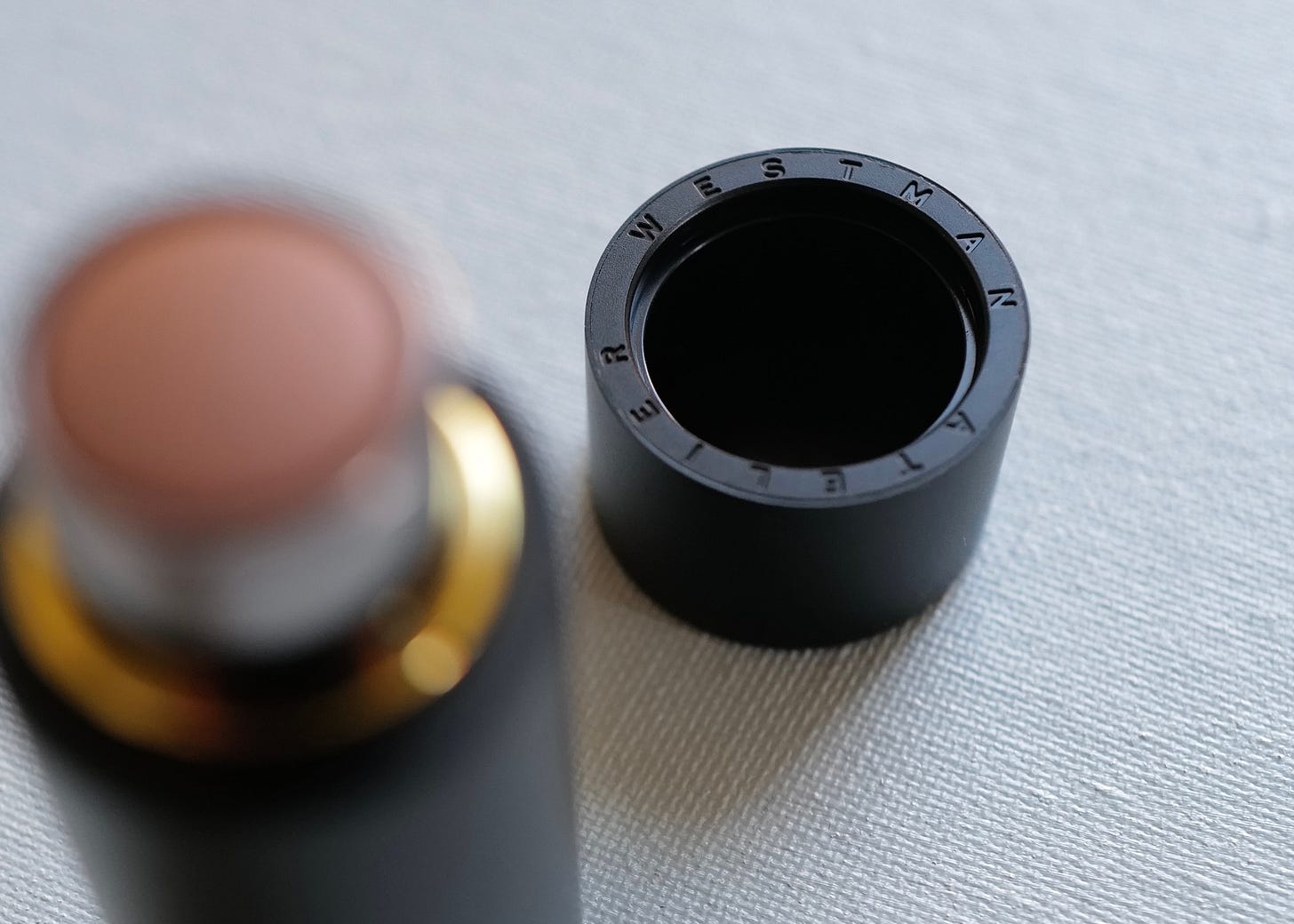
If a part can be detached, it needs to be seen as belonging to something bigger. This packaging from Westman Atelier is ingenious: a lid with a strong magnet to keep the makeup stick closed has an embossing with the brand's name. This demonstrates the attention to detail, giving the feeling that everything was thought out with great care. In a way, it gives a sensory pleasure similar to opening an Apple product, very neat.
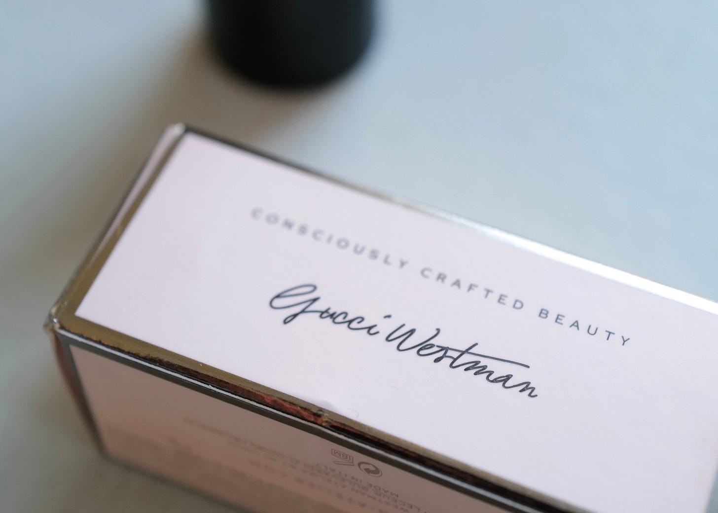
Behind an exceptional product, there are people. Anyone who buys a luxury product or service wants to connect, for various reasons, but always involving the human factor. Westman Atelier managed to insert a connection with Gucci Westman, the creator of the brand, in an objective and simple way. Note that the form and quality of the print are essential in order not to leave the signature tacky. It really looks like she wrote it with a ballpoint. On the subject of the creator figure, I recommend the article The Ultimate Luxury Branding Checklist.
Another way to bring the creative figure is through handwritten notes, as in the case of Emili, with a message from the designer and founder Emily Stefani Lee. The note accompanies an absolutely special packaging that protects the jewelry.
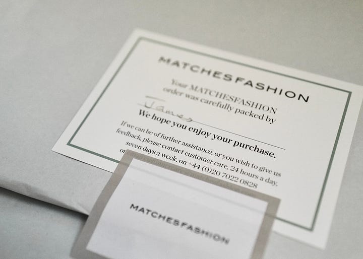
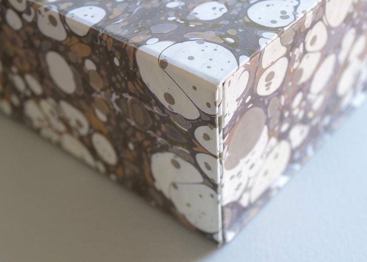
The human touch also comes from the attention given to the people who handle the product delivery process. In the case of Matches, the person who packed the purchases for shipping writes their name as seen in the photo. This is a friendly reminder that there are always people behind it who care. Without forgetting to mention the importance of secondary elements such as the print, which in the case of Matches is the iconic marbled print. How could you put this in the trash? The desire to reuse such a beautiful box is instantaneous.
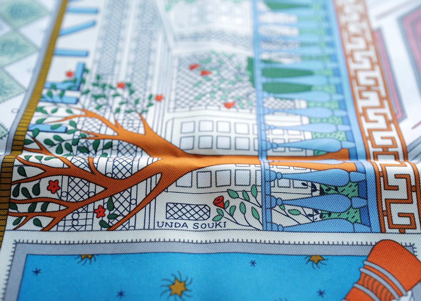
The logic to include people is also directly applicable to the product design. As in the case of this scarf from Hermès, signed by artist Rosa Maria Unda Souki—giving credit to whoever was responsible for the final product raises the perception of refinement of it, and shows the respect of the maison for its artisans.
Always present. In the photo, the base of a Chanel nail polish—note that the applied logic of placing the logo on the base is very similar to the design of a shoe sole. It's unlikely that a person will check the bottom of the nail polish, but if they do, the identity will be there in some form.
Visual identity is a system of elements that support and strengthen each other. In the case of the packaging of the jewelry and nail polish brand, J.Hannah, it is important to realize that the geometric shape of circumscribed rectangles and the embossed technique on the matte paper are elements almost as important as the logotype itself.
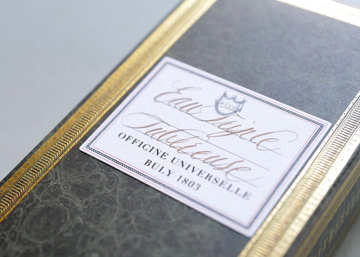
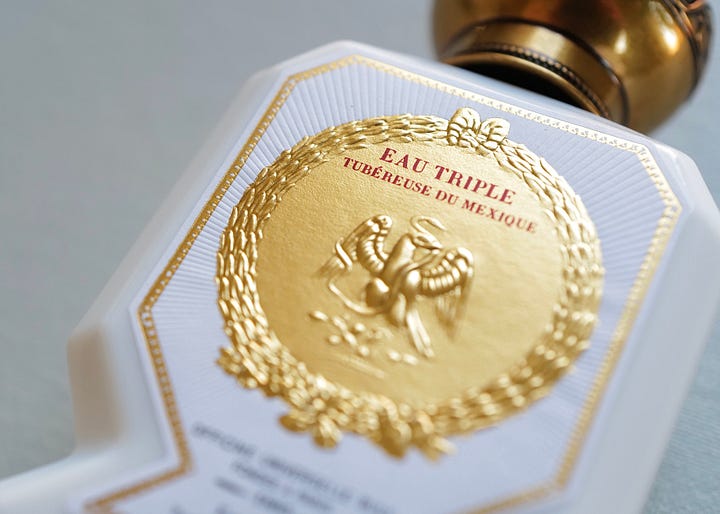
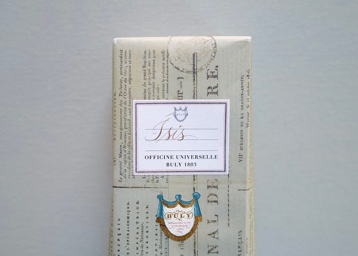
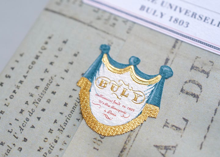
Technique goes beyond the product or service & Custom makes anything more special. Speaking of graphic technique, suppliers and professionals can play a key role in how the brand is positioned. In the case of Officine Universelle Buly, intricate and layered packaging plus custom and on-demand calligraphy make any item unique.
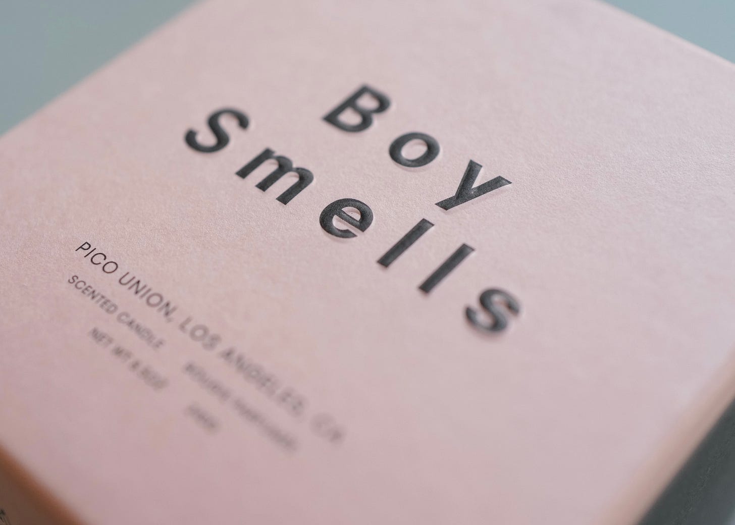
Elegance is not golden, it is intentional. Of course, sometimes a little sparkle makes perfect sense, but sometimes a monochrome print on colored paper and embossing do the trick. This packaging of Boy Smells candles is the perfect example. The quality of the design project has even more impact when talking about large print runs. That means on-target messaging, cost savings, and optimizing the potential to be memorable.
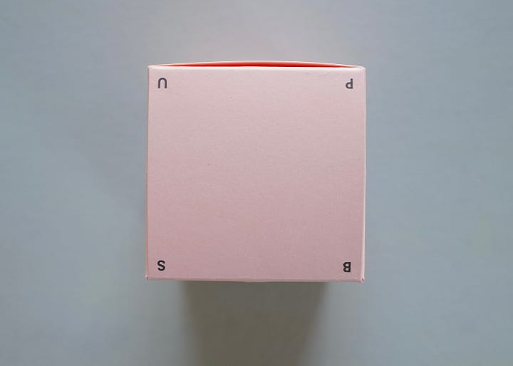
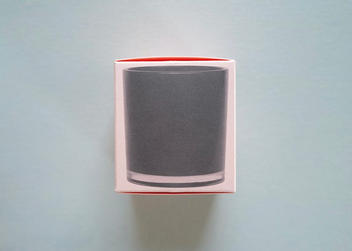
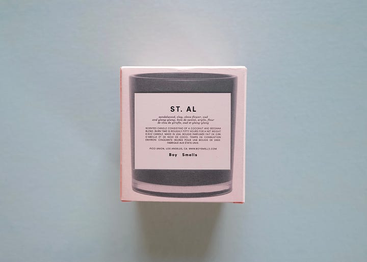

Honorable mention to the application of the initials of the brand and the place of origin on the folding lid (Boy Smells + Pico Union)—a smart way to make itself present from all angles.
Guidelines are the path to quality. A wonderful example is the Milanese magazine Cabana, famous for using extremely special fabrics as its cover. In a recent edition, they collaborated with the muse of Quiet Luxury, Loro Piana. This is a good way to raise the level of print to that of a collector's item, in addition to delivering the sensoriality of materials from clothing brands and interior design to a niche audience. The edge of the fabric always has a laser-cut look, which leaves some of the threads loose. This is positive because it shows the veracity and quality of the fabric applied. Luxury is consistency and excellence, not perfection.
The idea of gluing layers of material for covers also extends to the printed inserts that are sometimes found (see that it is an adhesive photo on pink paper).
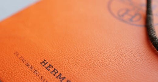
Consistency, even through the magnifying glass. Like most packaging seen so far, the paper has an irrefutable graphic function in Hermès communication. When the paper is smoother, it is for materials on which pen or pencil will potentially be written, so the brand applies the embossed with one of its signature graphic elements. But whenever there is an orange color, the paper has this speckled texture—a texture that resembles leather.


By the way, Hermès is one of the brands that invest the most and best in graphic resources. See that luxury, just as it doesn't have to be golden, it doesn't have to be serious: illustrations accompany the inserts and books produced by the brand. Quick note: I find the lamest automatic opinion when I hear that illustration is too girly, too childish, or only for “startupy brands that wish to look cool”. Illustration isn't for everyone, but when it makes sense and is well executed, it is LUXURY.


I invite you now to practice noticing these little beauties in what you have close to you. I would love to know what you find!
Signing off,
Ísis
If you enjoyed this edition, you may also like:


