Quiet Luxury applied to brand communication
There's something in the oven and you should check it out.
Keep in consideration
The topic of Quiet Luxury is everywhere: first in the fashion media, as it spreads its time to address the broad impacts on how brands communicate. There's something in the oven and you should check it out.
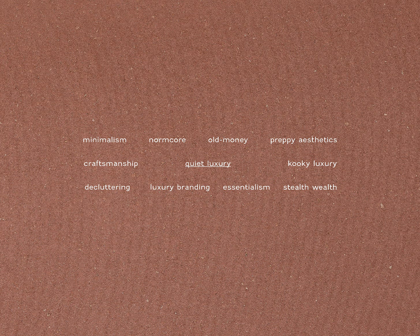
To understand repercussions it is necessary to understand their sources: the term Quiet Luxury is the result of a confluence of trends and cultural developments. A revisit to normcore, a twist on minimalism, old-money/preppy aesthetics, and a new perspective on products not tied to a single gender and de-influence. It seeks simple and unadorned clothing that is long-lasting and practical, with neutral colors and patterns, tailor-made or altered for a perfect fit.
There is also streaming production that has portrayed and gained extreme relevance for joking about the ultra-rich such as in White Lotus and Triangle of Sadness. It's commonly used interchangeably with Stealth Luxury and Stealth Wealth.
Stealth wealth is somewhat negative, but quiet luxury can be good as it's tied to literacy on craftsmanship. Stealth wealth is a mindset of living a "frugal" lifestyle while still having a high net worth. People who practice stealth wealth aim to avoid showing off their wealth through flashy material possessions and opt for a more subtle lifestyle. But as Amy Odell points out in the Succession series, this type of behavior is characteristic of the ultra-rich, who are so rich that they don't buy a luxury bag since their drivers and assistants carry whatever they need that day.
Quiet luxury, on the other hand, is about indulging in luxury but doing so in a subtle way. People who practice quiet luxury prefer investing in high-quality, timeless, not necessarily flashy or branded items. In quiet luxury, you have a bag like the ones from Bottega Veneta, which you know is because of the design, color, and no apparent logo. Again, in stealth wealth, you don't have a purse, as your assistant carries your stuff.
Another point that needs to be thought about carefully and researched is the use of colors in this movement. Quiet luxury means some sort of essence and focus seeking. In the same way that strands of minimalism have done in the past, quiet luxury can be interpreted as the affixed use of neutral colors, which is also a symbol of sanitized colonialism. "According to some art critics, sensory anthropologists, and historians, this mutual attraction and repulsion to color has centuries-old roots, bound up in a colonial past and fears of the unknown," says the historian and writer Carolyn Purnell for Apartment Therapy.
On the other hand, we have Kooky Luxury, a strong contender that is basically Quiet Luxury's eccentric sister. The term was recently coined by José Criales-Unzueta, whose article is an invitation to think about the frenzy and almost cult of expensive basics that the theme revolves around. He argues that luxury doesn't need to be basic or boring to be enduring through the ages.
"Stealth wealth is not a trend; it’s a baseline m.o. for the rich. [...] We seem to be much too preoccupied by what the rich are doing with their money. Isn’t the point of “quiet luxury” that it’s quiet? Let’s move on. There are far more exciting things happening in fashion at the moment than the fact that well-to-do people are still buying cashmere sweaters."
I'd say that perhaps the use of quiet luxury per se is not a new trend, but the interest in the subject for people from other tax brackets is. More than that, the bigger picture is that we're all looking for some way to escape banner-type branding with giant logos everywhere—quiet or kooky. With optimistic eyes, it would be amazing to think that this trend is a symptom that we already have as many clothes to wear the naked body as we need in the world for the next few centuries, so now we want something with an extra layer of meaning and sensory quality. Quality over quantity.
The synchrony must exist between branding and product design, more than ever. We are turning our eyes to luxury in its most positive light, that higher tag prices are the result of technical excellence and perfectly tied meanings. Logos, colors, monograms, prints, and all kinds of brand elements are once again played like an orchestra. A complex and harmonic recipe makes the brand undoubtedly present without being slavish.
A well-constructed luxury branding has stratospheric potential and needs to be carefully monitored. Having so many branding elements can become codes of worship instead of admiration. Pretension lives in the corner. For example, the person that wears The Row can sometimes be like the early adopters of veganism: they make sure you know their choices at any given conversation. Then it's just codified bragging, the if you know you know.
This all marks the return not only of the concept of positive luxury but to reinforcing brand elements alike. This is the general approach we have in the studio, so I suggest as a first step reading our Luxury Branding Checklist, which provides a panorama of possibilities as much as a concrete base.
If you're wondering who should adopt the ideas shown so far, I can tell you that big brands that aren't exactly quiet are already showing the impacts. From the most recent fashion weeks, Miu Miu showed an accurate color chart, with secondary brand elements highlighted. Burberry, on the other hand, even tweaked the logo with the arrival of the new creative director, recovered its original logo under a new guise, and relocated it to more noble, less blatant places.
I mean, that's the freedom to support more creative logos and signatures, as they are used more strategically. If the core brand identity elements are better used, we can finally leave behind the Helvetiquized logos and invest in something with flare and authenticity. The Row and Toteme are here to pave the way:
The Knights
Brands that were under the radar for a while are booming like no other: Zegna, Loro Piana, Brunello Cucinelli, Tom Ford, Brioni, The Row, Khaite, Bottega Venetta, Courrèges, Toteme.

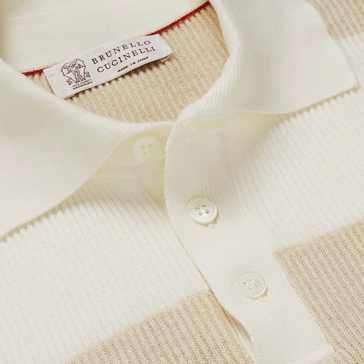
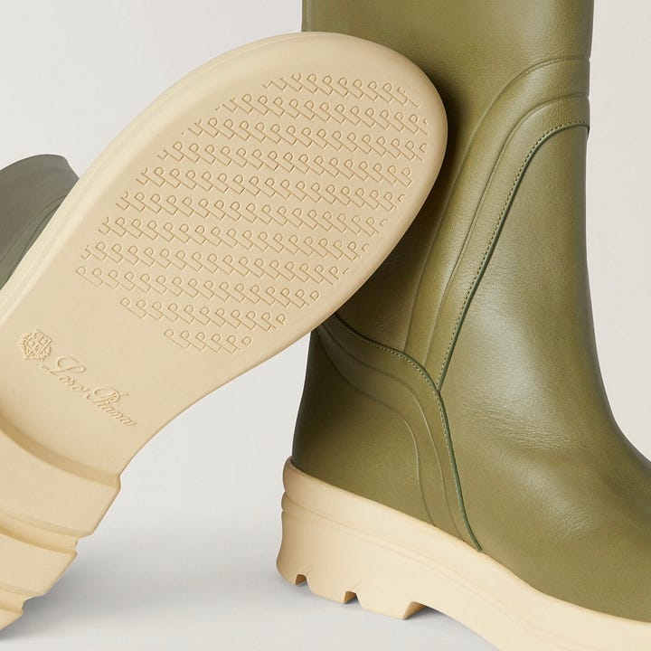
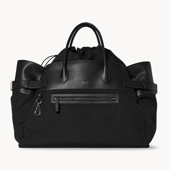
Some examples: 1. Shirt with no visible logo, with trompe l'oeil from Bottega Veneta, which looks like flannel but is actually leather. 2. Brunello Cucinelli label with elements heavily hinting at heritage. 3. Loro Piana boot, whose elements were all grouped on the sole: coat of arms, logo, repeating pattern. 4. The Row bag with a very tiny logo as if it were to be read very closely, that is, by only those who own the brand's product.
Although there's no recipe, to tie it all together, here is the list of things you should consider right now:
Take risks: creative while consistent and non-banner-like logotype placement
Diversify elements and complexity of brand identity: go beyond the full name logotype
Research and experiment: color palettes need to be thoughtful more-than-ever
Play product sections as sub-brands
Reinforce materials and techniques as branding elements
In conclusion, the synchrony between branding and product design is more important than ever and even brands that aren't exactly quiet are already showing the impacts of it. Ultimately, quiet luxury represents a return to the concept of positive luxury and quality over quantity.
If your audience is more interested in understanding what something well-suited means, what does that mirror in your communication besides your product? For a hefty dose of ideas, shoot me an email at isis@scharfstudio.com
Signing off,
Ísis
P.S.: Some additional good reads:
New season of Succession review by Amy Odell
Leandra Medine's takes on Quiet Luxury
Vogue Business: Explaining luxury’s new brand identifiers
Business of Fashion: It’s Not Just ‘Succession’: Why Quiet Luxury Is Everywhere Lately
Who What Wear: 6 Quiet Luxury Outfits Fashion People Are Wearing In Paris
Vogue UK: If You Pay Attention To One Trend This Year, Make It “Quiet Luxury”
Loro Piana The Gift of Kings
Apartment Therapy: Color, Chromophobia, and Colonialism: Some Historical Thoughts


