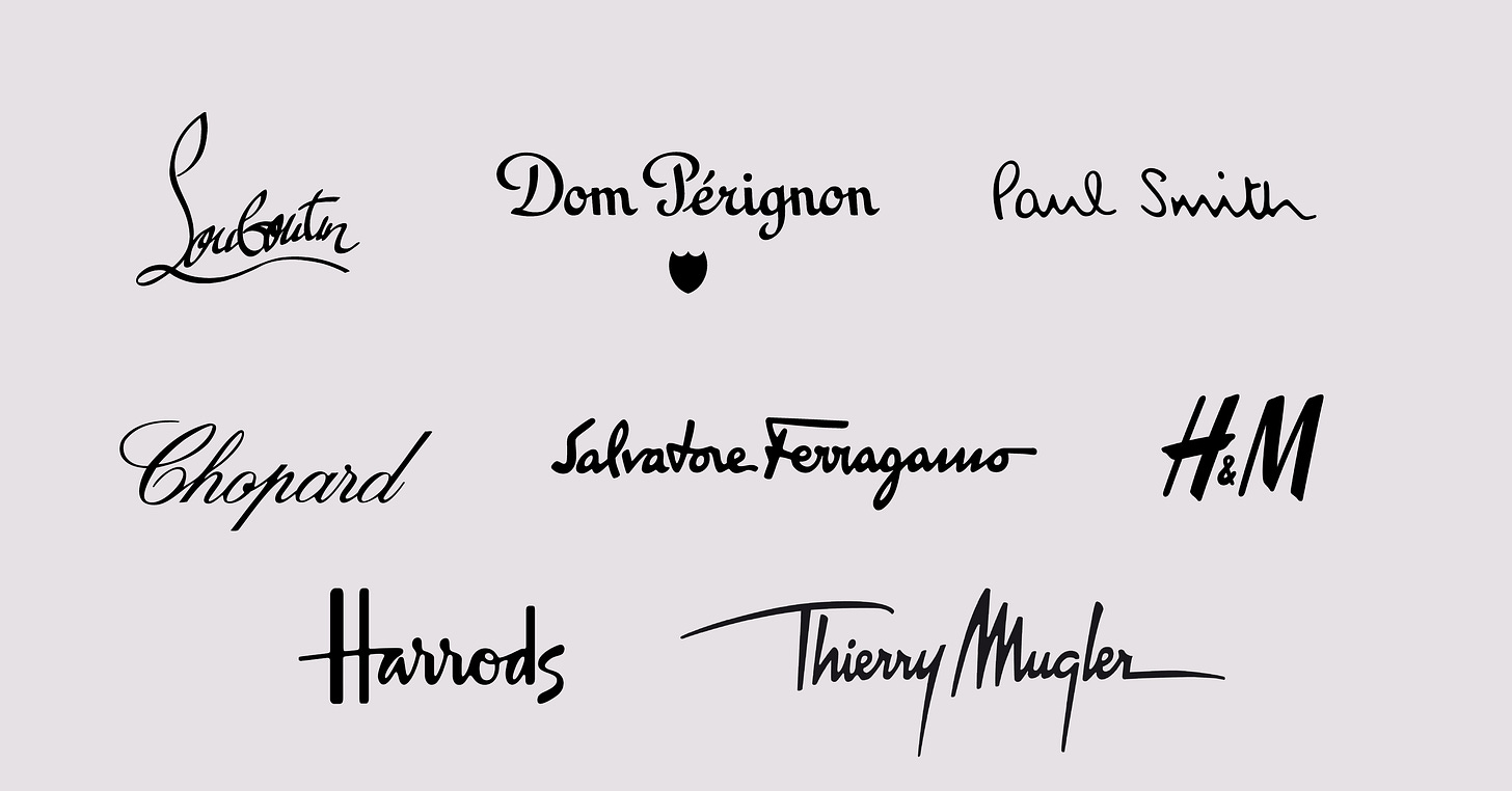
The logo and the hand gesture
Before we start
The modernist aesthetic is one of the strongest influences in today's communication of European and United States brands, where the idea of less is better reduces lettering to a place of superfluous and outdated. Many brands have undergone a redesign to a neo-grotesque sans serif style, with Helvetica on the pedestal. Among the most relevant brands impacted, we have Ives Saint Laurent, Zara, Burberry, and Pinterest.
This content is an invitation to talk about alternatives to this standardization, which is only truly bad when chosen unwittingly. Lettering and other decorative designs are very powerful tools, as they are loaded with personality in just a few letters — Not created to be timeless or easiest to read but to be genuine, memorable, and catch the spirit of the time.
At Scharf studio, we have always built brands on the understanding that the diversity of elements and their hierarchy is what keeps a consistent and healthy brand. That is to say, a quality logo can be in lettering or neo-grotesque typography, or even these styles can coexist between logo, monogram, symbol, institutional typography, and so on. The sky is the limit when everything is thought with due care and technique.

Sign here
The idea for today's newsletter came to me when I was watching Loic Prigent's coverage of the Schiaparelli haute couture show. The European brand carries eccentricity and surrealism in its DNA, marked by shapes as architectural as they are light, with contrasting colors weaving sumptuous materials. The juice of it is in the logo: a loose-line signature, as strong as it is lively, that manages to maintain admirable readability — perhaps the privilege of long names, in which some syllables can be more stylized without compromising the general form.
The idea of using the gestural trace created by someone's hand can come in different doses, as is organized further on. In terms of the meaning of style, lettering is extremely personal, like a fingerprint – and the name sign is the epitome of it. Lettering is the art of designing words by hand, where the flexibility of style alleviates normative restrictions and imperfections aiming at a punctual aesthetic strategy. The word as a whole is at the center of the technique.
The expressiveness of what is handmade carries a one-of-a-kind meaning, a combination of the person who draws with the instrument chosen.
Strategies that trigger the use of lettering
1. The creators' seal
The creator's name itself appears in some form, expressing a direct connection of the offer with a physical person. This connection may become more abstract over time, but the reason for choosing Lettering remains: it is a historical reference. Some examples are derived almost directly from the creators' signature, others have been adapted to techniques that help readability and memorization. In the latter cases, there was a partial redesign of letters to improve the reading of each letter of the name and thus facilitate search tools that work better in digital media. For example, Pomellato underwent a very smart and smooth transition while keeping the style traits, the gesture.
Other brands that fit this idea:
2. Write your name and it's yours
Sometimes, lettering appears as a variation of the logo, serving for applications in details of a print (as an anti-counterfeiting tool or to be more suitable for extreme sizing) or for indicating a special or commemorative collection, for example. Among the brands that best use this strategy, we can mention Pucci, Valentino, and Marni.
Pucci in particular is an example of the clever use of elements from very different styles that work together, creating products with high visual richness. In the images below, we can see the Pucci logo, Emilio Pucci's signature distributed on the print, the print, the seaside semiology with the fish, and so on.
3. Almost human
Some brands structured within a corporate background, or extremely fast-growing formats such as venture-backed startups use lettering techniques as means to mitigate some type of transactional relationship linked to their type of business. This happens more subtly, with for example e shift in the central axis and the extension of letter ends, as in the case of Allbirds. Typical traces of mechanical writing, with the behavior of the ink that is irregularly absorbed on the paper, create a tactile link with the name – Madewell, Radisson, Galeries Lafayette, and Ray-ban have logos with this characteristic.
Finally, I leave here a poetic perspective on what is written by hand:
"The mind rules over the hand; hand rules over mind. The gesture that makes nothing, the gesture with no tomorrow, provokes and defines only the state of consciousness. The creative gesture exercises a continuous influence over the inner life. The hand wrenches the sense of touch away from its merely receptive passivity and organizes it for experiment and action. It teaches man to conquer space, weight, density and quantity. Because it fashions a new world, it leaves its imprint everywhere upon it. It struggles with the very substance it metamorphoses and with the very form it transfigures. Trainer of man, the hand multiplies him in space and in time." — Henri Focillon, In Praise of Hands, 1934.


