


A room of one's own, n. 2: Bags and brands


Brand and Bag
Beyond functional products, bags are silent storytellers: carry our dreams, necessities, and aspirations, embodying our personal journeys in every stitch and pocket. Handbags are among the products with the greatest expectation of long-term use, so much so they often serve as the initial luxury investment for newcomers to the world of upscale goods. They are more durable than clothes in general and have the power to transform a look.
Therein lies the challenge of implementing brand communication in a way that makes you present, and transmits the message, without being tiring. Here are some of the ones we've been collecting lately, and what they tell us.


Tridimensional
Flexible
Consistent
For the Stella McCartney case, the charm of the visual signature, which includes the logo, its surrounding elements, and various iterations, lies in its creative use of materials. Whether through cutting or embroidery, the distinctive dotted logo is applied to exploit its sensory and three-dimensional qualities. It's important to highlight that the challenge lies in the need for a well-versed design team, as the size of the dots composing the letters varies depending on the product's size and style. Additionally, the array of signature versions showcases the brand's mastery in selecting and working with unconventional materials (it does not use leather or fur).


Typographic
Risk taker
Clever
Burberry deconstructs its distinctive visual signature, which includes the logotype, knight emblem, and smaller elements, scattering them across its product range. When the full name logotype can't be accommodated, they employ the Thomas Burberry Monogram (TB), inspired by an original archive drawing. This monogram is employed both on its own and as a repetitive pattern. This design approach celebrates the fashion house's rich heritage and reflects the spirit of its founder, whose initials are integrated into the design. The embossed Knight emblem adds a refined and subtle touch to the deconstructed 'B'.


Reinventive
Organized
Graphic
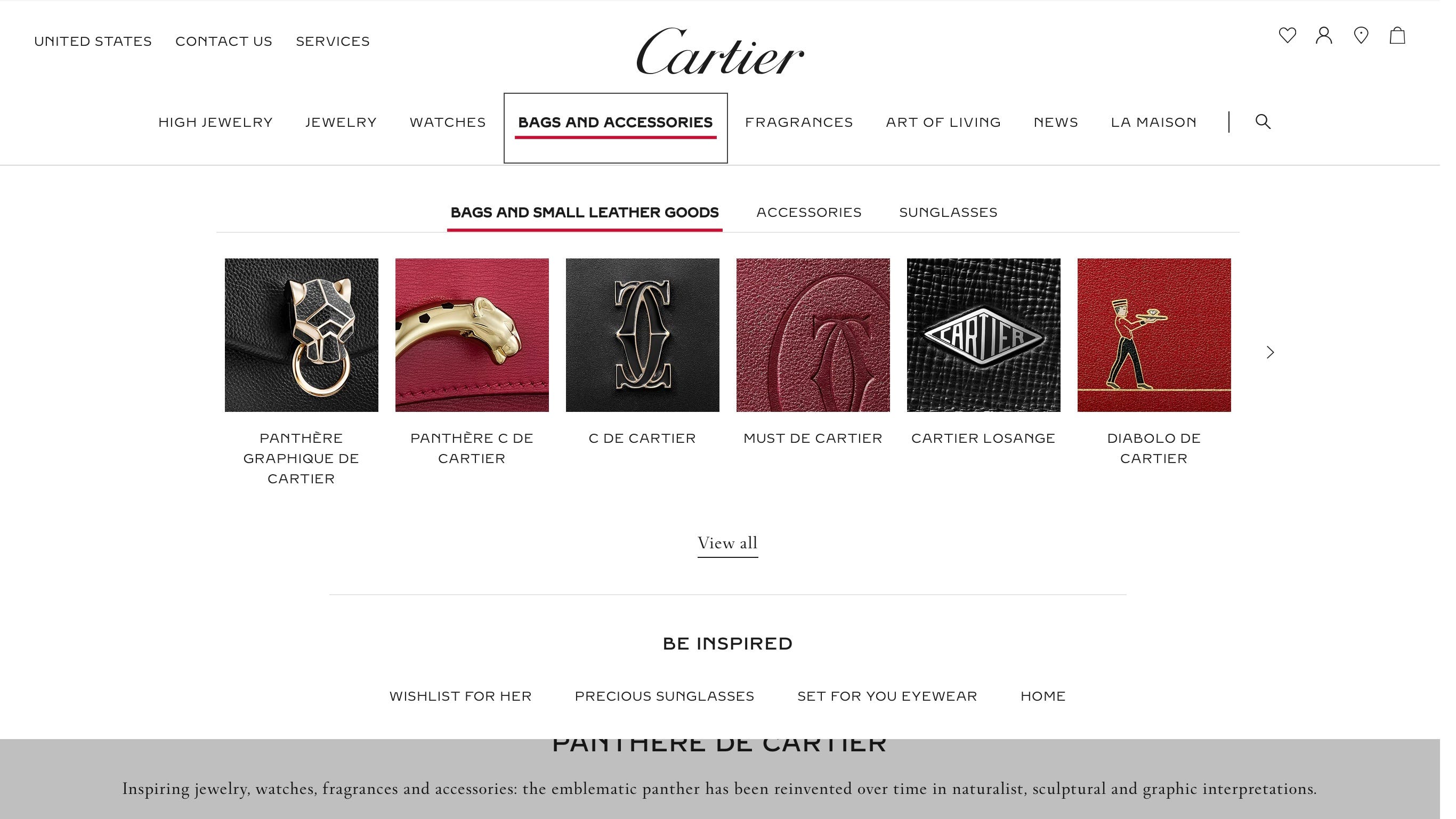
The brand is very protective of the main logo with the Cartier name and chooses to create lines with their own identities, almost behaving as sub-brands. The differentiation is clear and intentional, as can be seen in the website menu screenshot. It is worth highlighting the power of type design in this case, which goes from monograms, and shape manipulation, to a letter drawn like a panther's body.


Consistent
Heritage driven
Easy
Loewe bags feature two key elements: a distinctive logo bearing the Loewe name and a monogram design characterized by four stylized letters Ls. While the brand consistently pushes the boundaries of innovation in its product offerings, it maintains a reverence for its elements. This decision results in a fascinating balance, where innovation flourishes alongside a commitment to the brand's heritage.


Discreet
Encoded
Complex
Bottega Veneta is only quiet about being luxury for those who don't care about the brand. The truth is that its fans know very well how to identify the author from afar. The products are drenched in identity, with a variety of elements that seem more like their own language: embossed logo accompanied by "made in Italy", the intrecciato as a material and as a graphic form (strong signature), knot and triangle as some of the many indicators of production and collection.
Signing off,
Ísis M. W. Brennan
If you liked this subject, you might also like:
A room of one's own, n. 1

Keeping that cute tag after you take off your new clothes; Leaving one of those thick cards you tested the perfume in your bag; Saving a business card of someone you don't even need to contact (but it's good quality paper). There is a considerable group of people (me included) that are crazy about these little stationery items—there's something so pleas…