The Boston Appartement — 119 Newbury Street, Boston, MA 02116
Hi! Following up on the last post in the series, these are notes from a field expedition to Sézane's shop in Boston. Following the premise of mystery shopping, we share our thoughts through the lens of brand communication. This is a long one, so you will only be able to read it fully from the app or desktop view.
Quick Intro
Sézane is a French fashion brand founded in 2013 by Morgane Sézalory—the company name is a play with some of the syllables of the founder's name, and its sonority is the perfect introduction to the French perfume that it exudes. The brand initially sold vintage clothing items before evolving into its own line and was key to the dissemination of a contemporary French romantic aesthetic. In fact, its audience behaves like a fan club with people who want to live in this romantic world, the Sézanettes. Here is an excerpt available on the official website:
"Born in France: The story of Sézane begins with a forgotten suitcase and a love of vintage. Upon discovering an abandoned collection of vintage clothing, Morgane Sézalory began making slight adjustments to the pieces, and selling her finds online under the name ‘Les Composantes’. Her monthly drops, or rendez-vous, became an anticipated event in France. By 2013, Morgane realized she had found her calling: she began supplementing her vintage pieces with her own designs & Sézane was born."
Sézane offers clothing and accessories for women, while their sister brands Octobre Éditions serves the men's selection and Les Composantes, home items. From looking at street styles and social media, accessories seem to be one of the strongest points of brand recognition and desire. Between all offers, there are three strategies: fixed items always available throughout the year, seasonal collections, and some drops. Although there is always something new, they are linked more to style than to trends.
Sézane has established close relationships with Europe-based factories, enabling them to offer premium products at competitive prices. The brand is committed to sustainability, with B Corp certification, a reduced carbon footprint, and an in-house recycling program.
As for competition, Sézane is accompanied by other French strong names as Ba&sh, The Kooples, Maje, and Sandro. It stands out by staying on the less expensive side of the spectrum, with items ranging from $25 to $500, and most of them standing closer to $150. The brand very rarely gives discounts, and if it does, they are small. Other distinctive factors are the wider size chart and softer colors and patterns. The result is a closer touch to the idea of a "Je ne sais quoi for all" that the brand states throughout its communication points.
The company is currently expanding in the US, and collaborations and pop-up stores have been key strategies for raising awareness and attracting customers. They had successful pop-ups in Los Angeles and San Francisco, leading to the establishment of permanent stores. Sézane sees the U.S. as an exciting market, and Boston is home to their latest pop-up.
Some graphic design considerations
The brand clearly wants to convey the idea of a subdued and dreamy luxury linked to craftsmanship, constantly referring to what it offers as products coming out of ateliers (and not from the factory floor). This runs through all communication to the center of the visual identity, the logotype:
Note that this handwriting-style logotype is the main and most recent one, but the brand has continued to add versions over time. It's the case with most logo variations we've studied in the studio—from primary logo transformations over time, as well as versions with taglines, and sub-brands. Just to illustrate, see how the one on the official Instagram profile is totally different:
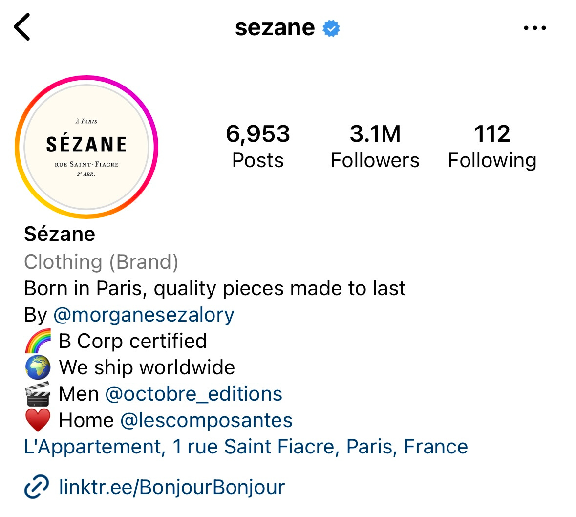
This variation opens up a great risk of going wrong, but I suspect that the brand is in a moment of sharp growth and internal adjustments are making it look a bit messed up in fact—it must be a snapshot at an inconvenient time. I say this because the brand really looks good in terms of audience interest and interaction on social media. If we look for a point of congruence between the Sézane logos and their versions, as well as that of the sister brands, the gestural brush stroke is what brings everything together. This brush stroke also appears strongly in several other adornments, as in the case of the edges of this scarf packaging:
The result is this look as unpretentious and casual as gouache scribble. Finally, note that the text typography weighs heavily on the overall identity, somewhat offsetting the faded brand color. It is instilled with vintage layout styles as if taken from the pages of an old book (hence the center alignment, varying sizes, and weights, use of italics, etc.).
Sensory Inventory
Now, I invite you to recreate the space in your mind with some notes of the senses:
Sight: warm, organized, personal, simple
Smell: clean but unscented
Sound: something hipster, alternative, and Bohemian (I shazamed Hands in Pockets by Laura Gibson there)
Taste: not offered
Touch: soft and cozy
Keywords: loose furniture, wood with wear marks, rugs, books, calm, warm tones, independent spaces
The visit
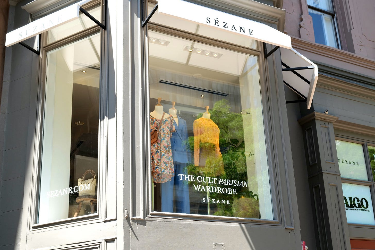
I went to the store on a weekday afternoon in early July, a couple of weeks after the pop-up opened its doors. Even though the brand did an excellent job of making me aware of it online, it was the first time I had physical contact, both with the space and the products. Sézane's stores are called appartements which in this case made even more sense as it is on the second floor of the building in a street that is both commercial and residential.
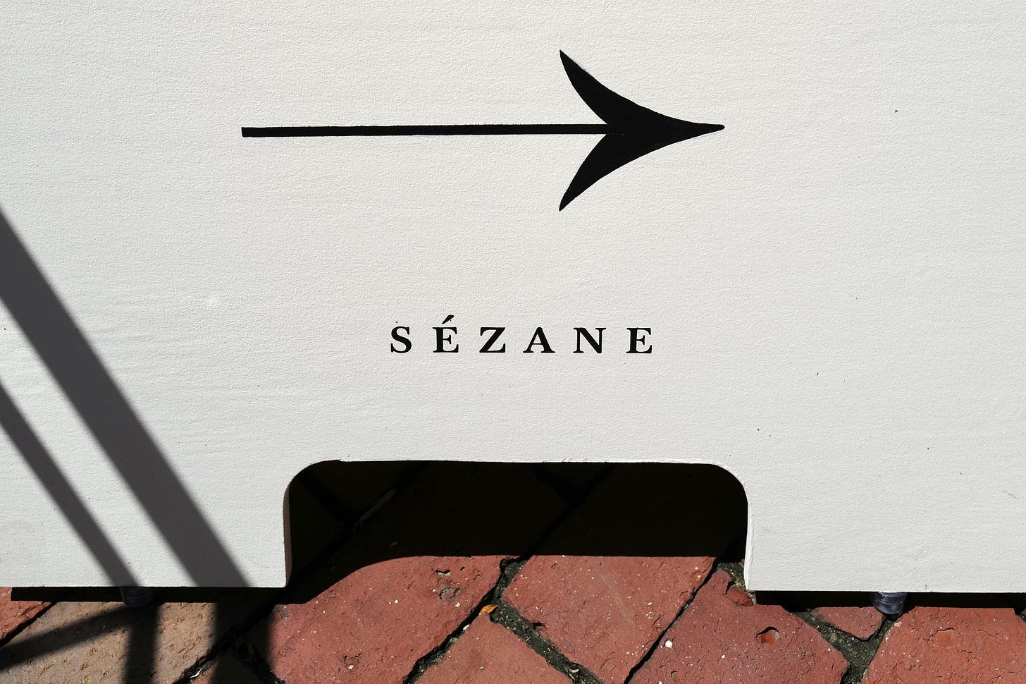
As the store is not on the street level, they used a sidewalk sign to invite passers-by to visit. Here's my compliment on the care taken in using a proper hand-painted sign, a touch that makes all the difference. The sign also reveals that more than being French, Sézane is Parisian. It carries Paris with it.
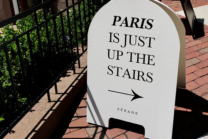
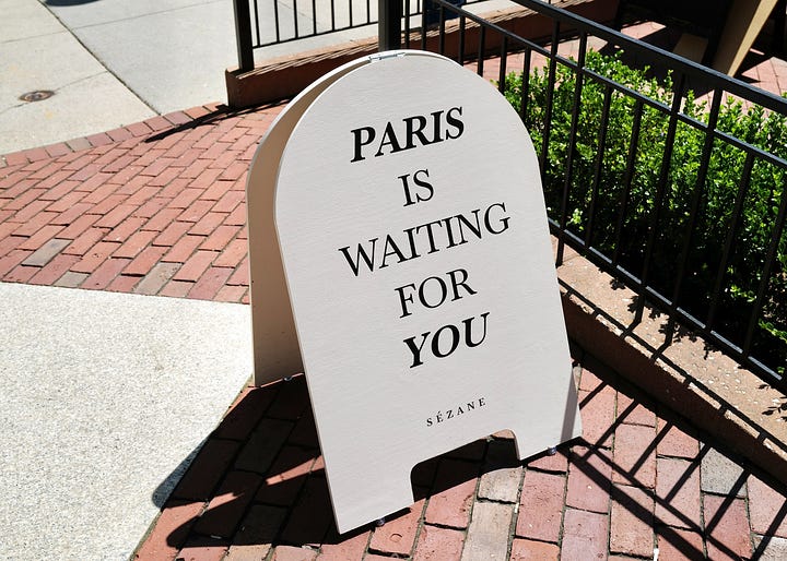
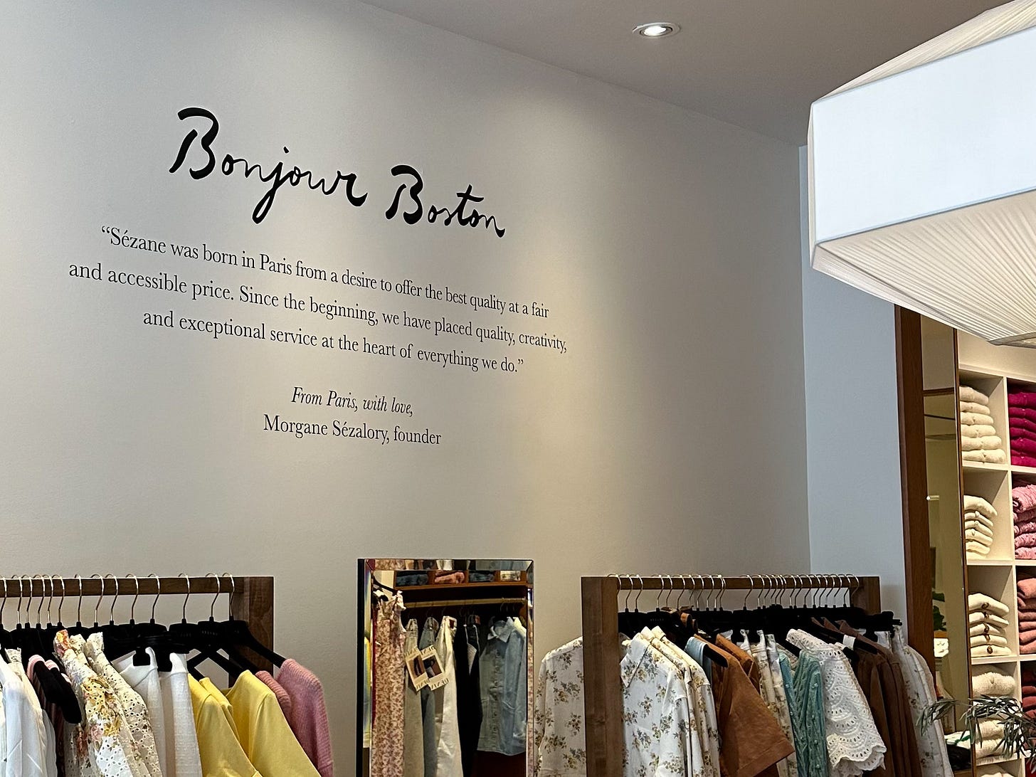
The first thing you see when you walk in is the opposite wall with a welcome message from the founder. Boujour Boston!
Presenting the figure of the creator as a communication tool is one of the requirements of a well-communicated luxury brand, and Sézane definitely wants to position itself as such, even though it plays like affordable.
The first impression is of the casual air, which comes mainly from the decor with loose furniture, pictures, books, and plants that could be seen in a real home. Even the made-to-measure furniture had a walk-in closet feel. The hint of a European home comes mainly from the vase with natural plants and a larger amount of materials combined (granite, different natural or painted woods, indirect lights).
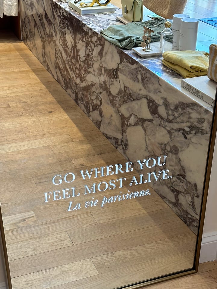
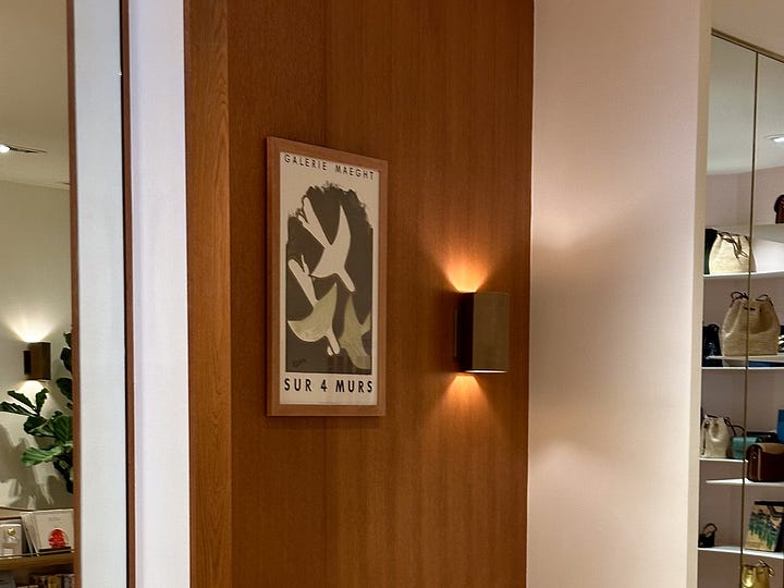
But there are two elements that really remind you that this is a store: the lack of chairs to sit on and the amount of writing here and there. What good are the books on display if there is no time to read them? They lose reality and become just scenery. From phrases like the one in the mirror, although it might make sense from an Instagram approach or to help explain the brand, could it be supplied by better training and engagement from the salespeople?
By the way, the service was pretty bad, but it may be more reflective of a broader issue in Boston rather than an isolated problem specific to this shop. It was completely uninformative and not friendly. That's a conversation for another time, but I wonder what encompasses their salespeople training.
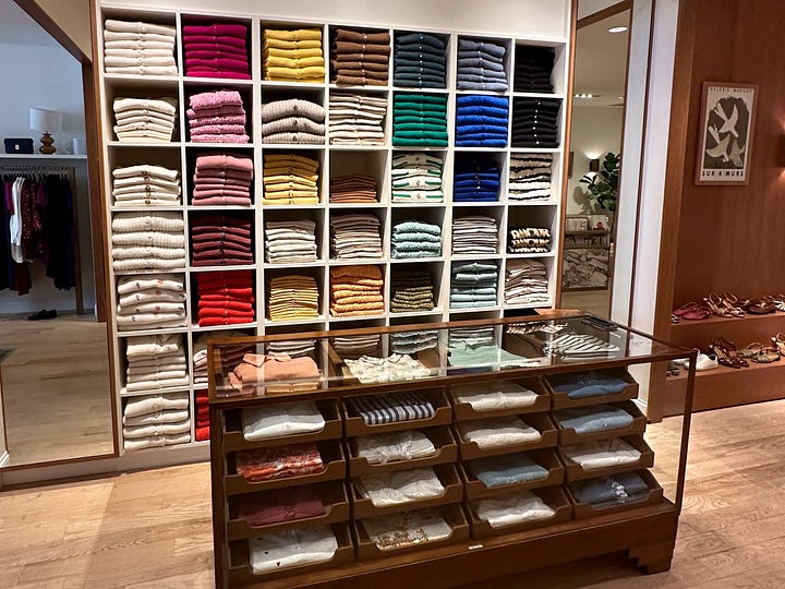
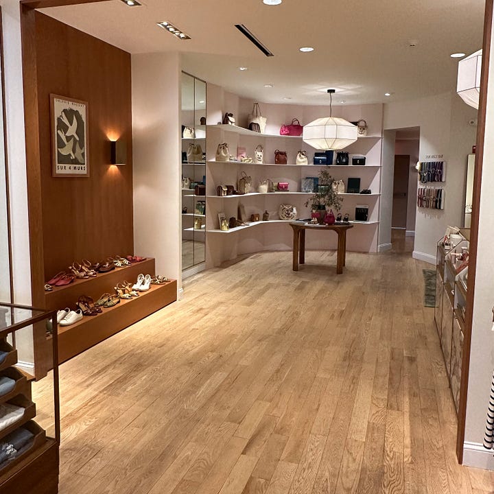
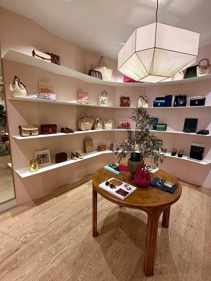
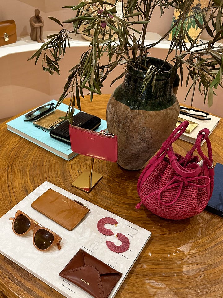
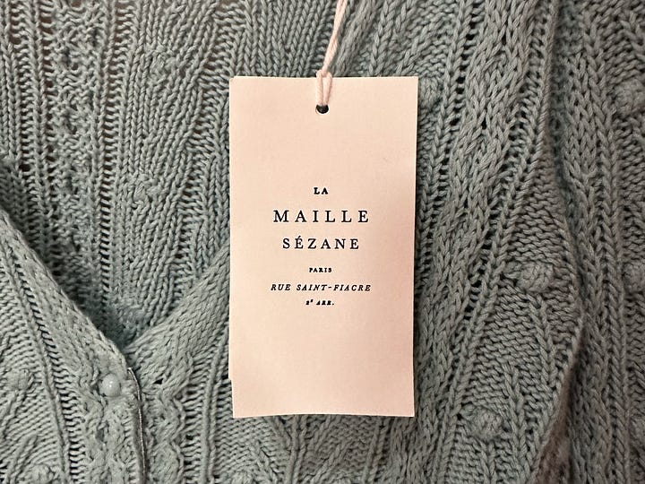
Transitioning from interior design to products, it is worth mentioning that the color of the decor connects and highlights the style offered. The clothes' soft colors and prints are complimented by the natural materials used as a backdrop. The items are displayed interspersed, in a logic of looks to be assembled. For each type of product, there is a different label, with an infinity of category sub-brands. The typical typographic treatment and brush strokes are the common ingredients in all the brand recipes.
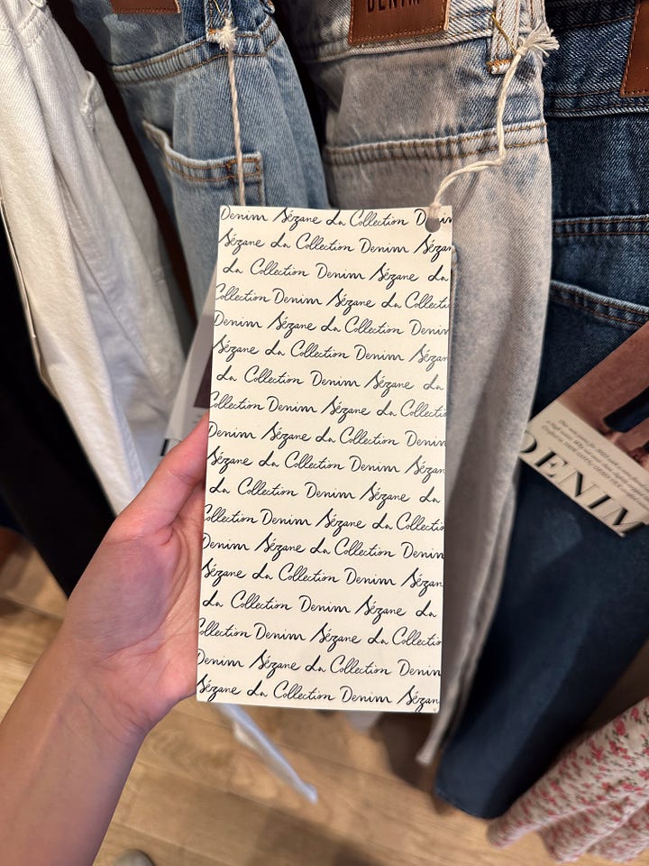
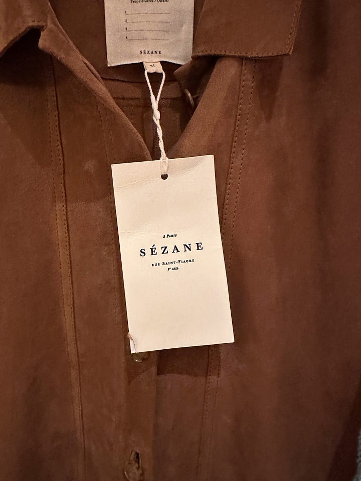
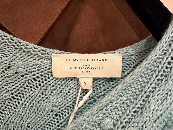
Now, looking at the application in a particular product, this suede jacket. It's a good example of expert brand use but also a missed opportunity.
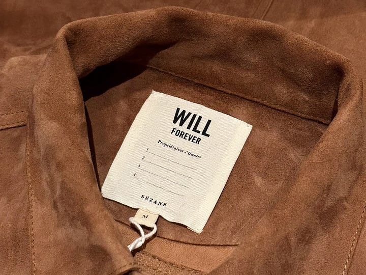
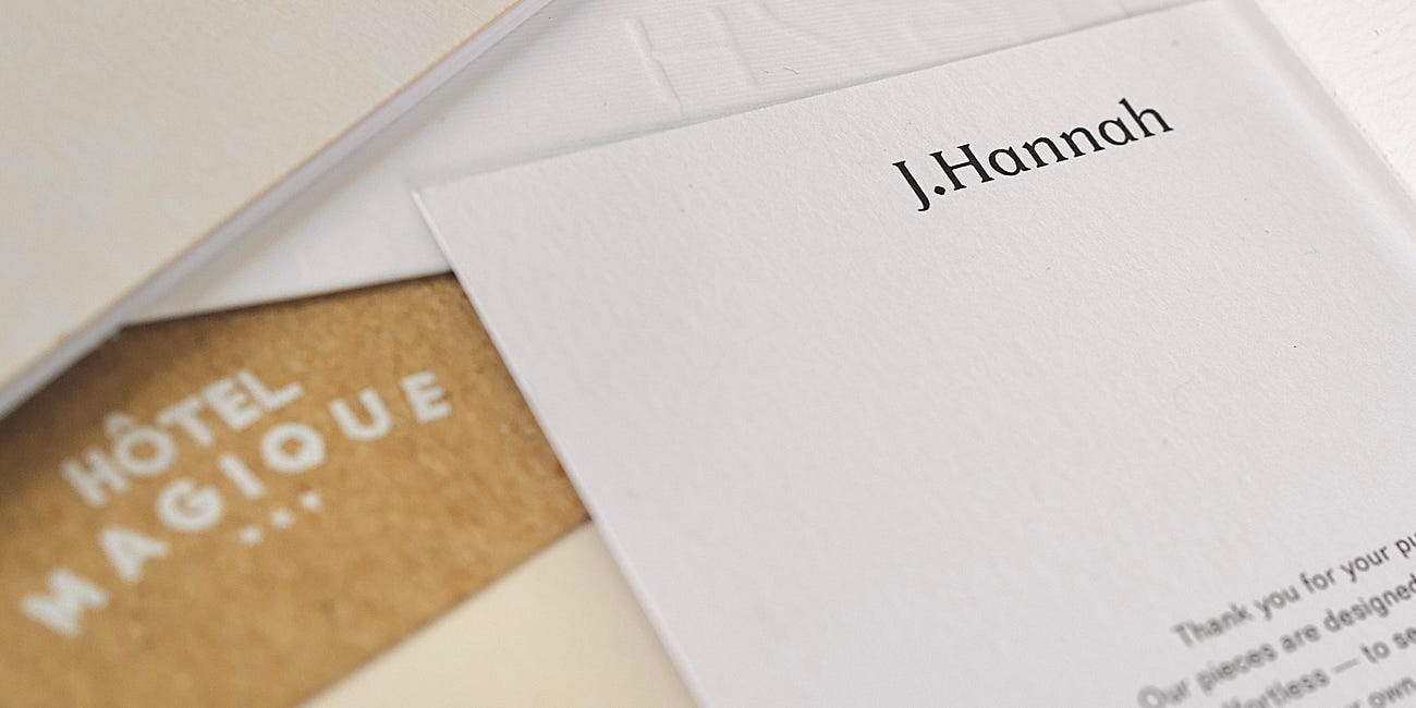
Firstly, the brand ensures comfort by embroidering the fixed label on all edges, preventing any discomfort while wearing the jacket. The tag with the brand name will not be cut off. Furthermore, what truly sets this jacket apart is the brand's commitment to longevity. By providing a space to record the names of previous owners, the brand emphasizes the concept of provenance. This not only promotes reuse and sustainability but also adds a sense of increasing value. Provenance is an important luxury brand tool.
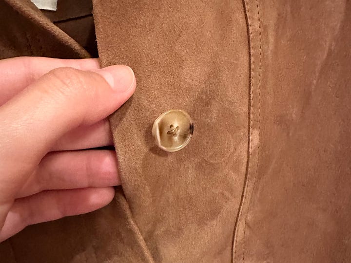
Secondly, there are certain details that the brand overlooks, such as the buttons. Why not put a variation of the logo there? Maybe a symbol or a monogram? Luxury brands must pay attention to the smallest details, both visible and invisible, even if the clothes are inside out. This is where the importance of a diverse and complex visual identity is, serving as subtle markers of authenticity and genuineness, appreciated by informed customers and loyal brand enthusiasts.
Last note: on that hot day in early July, a chair and cold iced water would have done wonders.
What did you think of this edition? Do you have thoughts to share about Sézane? Send us a DM, we'd love to hear from you!
Signing off,
Ísis
If you liked this subject, we recommend:
The ultimate luxury branding checklist
Our checklist is based on experience at the studio, added to the theory of Jean-Noël Kapferer and Vincent Bastien, two of the most important voices in the luxury market described in the book The Luxury Strategy. The original checklist has 9 items, some of which are different in order. Nevertheless, we highly recommend reading the original requisites lis…






Absolutely loved this post! It truly felt like I was right there at the Sézane store, experiencing it alongside Ísis