Hi, welcome to Notes Taken! Following up on the last post in the series, you will find below our field observations about the startup One Medical. The brand was handpicked for its outstanding particularities and the observations result from online and in-office experience as real clients—proof that even a visit to the doctor can become brand study material.
Quick intro
I'm Isis, Scharf’s Creative Director, who first mentioned the brand at our conversation table. I have been a patient at One Medical for a minute and have visited various addresses since I started considering this article. If this is the first time you're hearing about them, here's the bio available on their website:
“One Medical is a membership-based primary care practice on a mission to make getting quality care more affordable, accessible, and enjoyable for all through a blend of human-centered design, technology, and an exceptional team. Our members enjoy seamless access to comprehensive care at calming offices near where they work, live, and shop in twelve major U.S. markets, as well as 24/7 access to virtual care. In addition to a direct-to-consumer membership model, we work with more than 8,000 companies to provide One Medical health benefits to their employees.”
The care is offered through in-person and online resources, with a mobile app—a seamless interaction that constitutes one of the best cases of a functional omnichannel approach.
Taking the website as a first impression, it's easy to tell it's a young and modern brand before you even realize it's related to healthcare. The logo is written in lowercase, with uncomplicated shapes. Its hierarchical presence (or how much attention is drawn) in communication is not secondary, but definitely subtle. Eyes are first greeted by the photography, the way that people are portrayed, followed by the typography. It's interesting how the weight of the logotype is right in the middle between that of display typography (GT Super) and body text (Ginto).
The cleanliness and brightness of the typography and colors could easily belong to another D2C offer, such as a dermatological line. The photographic direction has more relaxed poses and angles, and very warm treatment.

The app
The 5-dot form is easily recognizable and widely applied. The challenge may be managing all your small optical adjustment variations depending on application size and background color—which in this case is very well executed.
The main color is green which seems to have been extracted from a lawn at the peak of its health, which then unfolds into lighter tones, with bluish and yellowish undertones. The accent color is a brighter yellowish green, like that of a freshly budded leaf. The white plays an important role and is used as background from the icon to the entire app.
The overall look is pretty simple, which is good for being practical. No fancy motions. The visual complexity is given more by the small profile pictures of service providers, doctors, and nurses: One Medical makes it clear that there is always a real person assisting you.
The visit
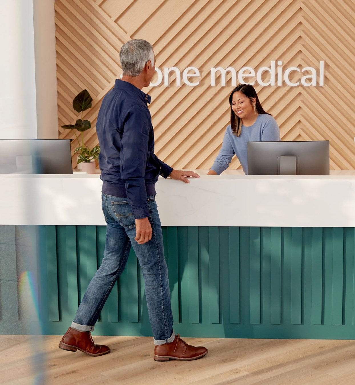
Their offices are located in very convenient commercial areas, which makes the visit a stop between day-to-day errands rather than a trip to a hospital. Throughout the brand communication, the proposal seems to be the shift from a place of treatment for sick people to a place of health improvement.
At arrival, I was promptly greeted with a friendly hello and a disposable mask. There were a few other people waiting in the room, comfortably spread out on chairs and sofas. I tend to get to places early, and the wait time given is exactly what it takes for the doctor to call my name. This may be a more particular opinion, but the service provider's attention to punctuality puts my time as a client at a level of value equal to that of the doctor, which was much appreciated.
Sensory Inventory
A quick stop to recreate the space in your mind, with some notes of the senses:
Sight: artworks properly framed, variety of furniture and seats, pretty coat rack, pretty plants but plastic natural light.
Smell: no particular smells, clean.
Sound: a playlist made up of non-famous singers, with a style that swung between pop and country. Shazammed: Ingrid Andress, Sam Hunt, Teddy Swims.
Touch: Warmth: leather caramel and dark, wood, wool, light gold metals. Wood floor in the doctor's room where I got barefoot.
Taste: water, as a stop, welcoming.
While I was waiting, I had Wi-Fi, water bottles, and plenty of space to sit. A note to the water bottle: these small courtesies make me feel like I'm in a moment of pause, and that my presence is welcome.
The doctor calls my name, in the same standard tone of voice, calm and receptive. As an immigrant, I notice (and appreciate) it is standard to confirm the pronunciation of my name at the beginning of the conversation.
One of the interesting aspects is the attention to every little detail, as in the beautiful wooden floor in the medical examination space, where you get barefoot. It is a type of floor that you would have at home, and that in no way resembles a hospital or so.
Another example is the pen that sits on the counter as brand merch, a minimal form made in soft velvety rubber. The brand is not only present in every type of application, but each decision seems to have been the result of a thoughtful process and concern for quality.
p.s.: One Medical's architecture and visual identity are pure symbiosis. I recommend watching the video that their architecture team made available on YouTube: The Doctors Office, Reimagined: Good Mood Lighting.
Signing off,
Isis May


