Inside a typography workshop
Raquel is the head of Gapski Typography, a relationship that in her own words is visceral. After twenty years of practicing law, she fell in love with movable type at her grandfather's old workshop.
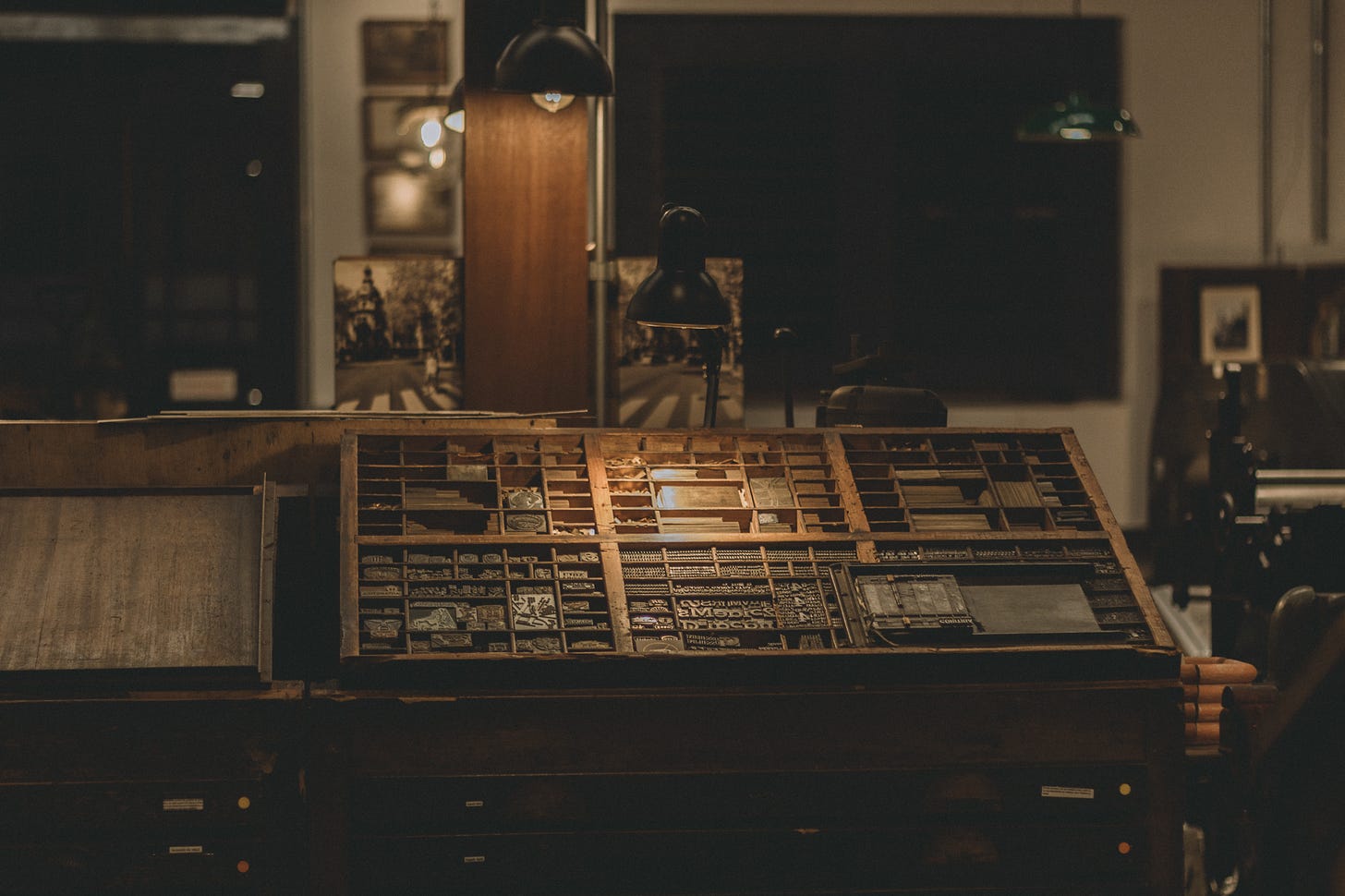
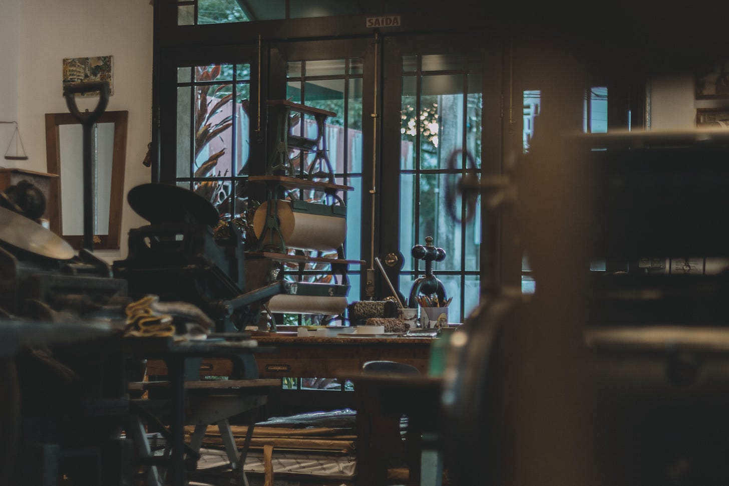
Gapski Typography is a key stationery supplier for different types of customers, including lawyers, architects, and, above all, brands that seek to create a memorable presence. In the workshop, clients have access to the entire printing process, getting familiar with movable type and the machines of the old typography.
To understand the story of Raquel and her family, one has to go back to the mid-forties, when her grandfather and his brother installed a small mechanical lathe in the back of their parent's land. Over the decades, the range of activities changed from manufacturing printing machines to their own typography. In 2020, the youngest granddaughter saw the beauty in this forgotten treasure and embarked on an adventure to rescue the family memories.
Visiting this space was a kind of return to the past—we hope you enjoy this journey with us.
How would you describe your profession today, and how did you get to it?
I describe my profession as a paper tailor because I see a great similarity between the sewing of made-to-measure suits and the production of handmade stationery. In the era of mass production and disposable products, I combine the traditional technique of letterpress printing with special papers to create personalized products in a sustainable way.
I got here by cross paths. I have a law degree and, after 20 years of practicing law, I fell in love with the movable type I met in my grandfather's old workshop. When I saw the delicacy of the material that could be produced in those old typographic machines, I had several certainties:
The certainty that it was what I wanted to do;
The certainty that my mission was to rescue my family's history;
The certainty that the productive artisanal knowledge of letterpress printing needed to be preserved;
And the certainty that many other people would be delighted with the creations made here.
Gapski comes to life in a family shed that has been closed for nearly four decades. How do you feel about it now and how does it affect your daily routine?
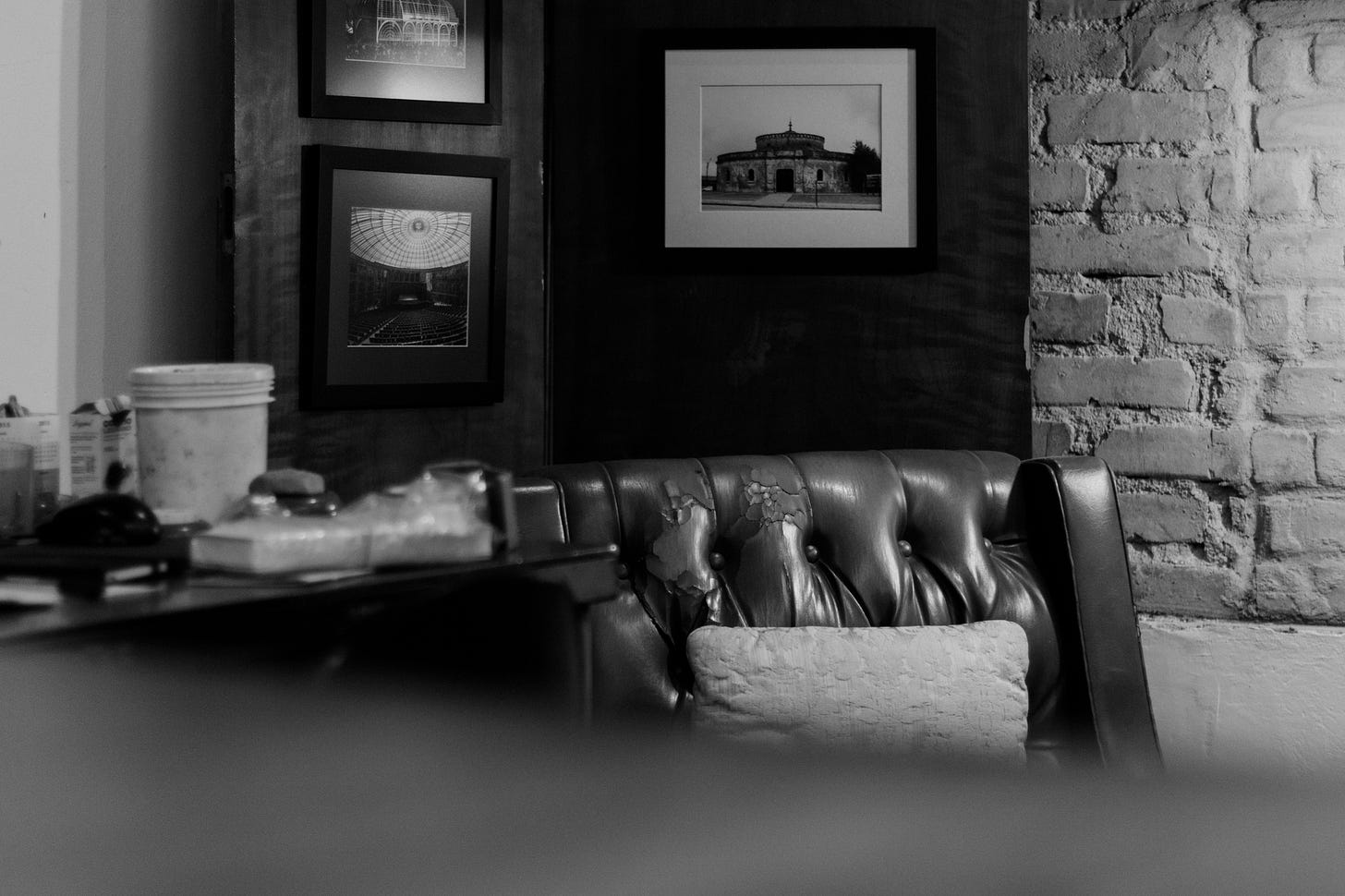
I am grateful for the opportunity and privileged to be able to bring this place back to life. On a daily basis, I feel the very strong presence of my ancestors here and this brings me calm and, on the other hand, the responsibility to honor the commitment to the serious and honest workforce that moves my family. Remembering what was done inspires me to keep going.
At Scharf studio, we believe that even the most strictly digital brands benefit from sensory connections in their communication. Your work is done by hand, for physical deliveries. In your opinion, how can a brand benefit from this type of printing?
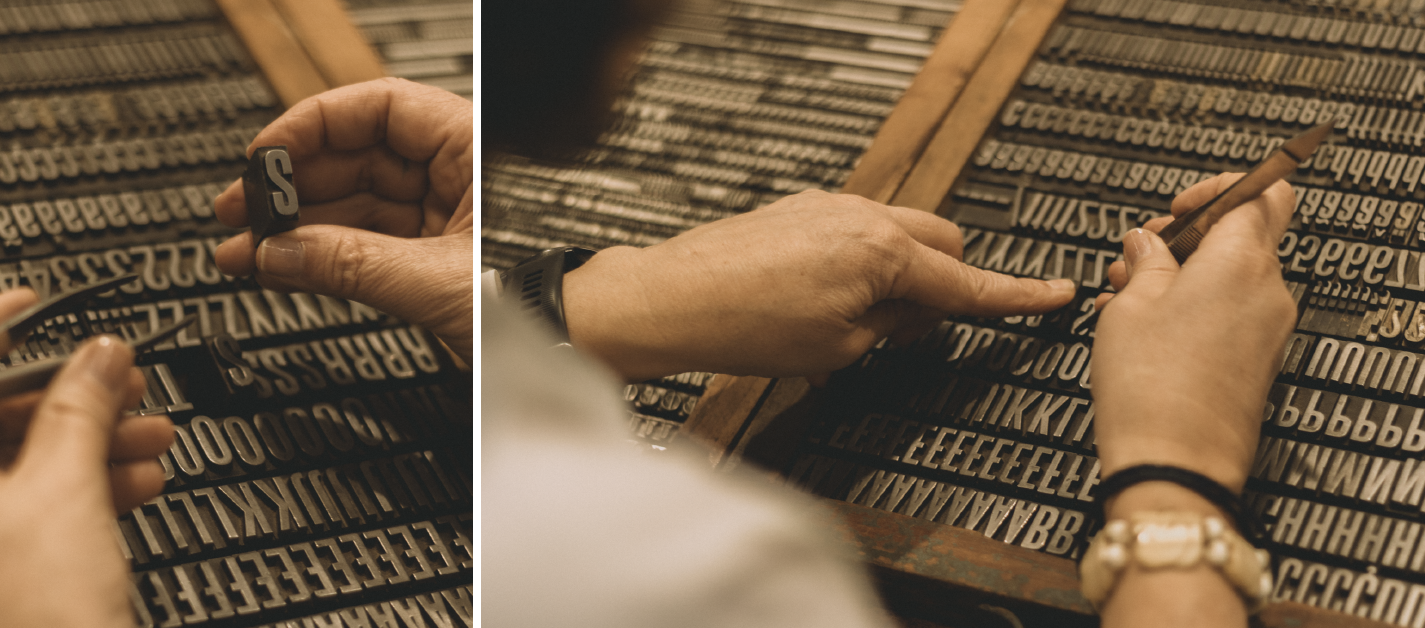
I usually say that letterpress is a print you see with your hands. The tactile aspect of the print made on heavy centenary machines on special papers is unique and does not go unnoticed even by the most distracted. The pressure of the matrix on the paper produces a slight low relief and gives the print a very special charm. That's why I think that even strictly digital brands have the opportunity to make themselves felt through manually printed material, even if in a punctual and targeted action.
Are there cases where this is not the best option? Why?
I have no doubt that they exist, as they are completely different premises. While a digital action targets an unlimited number of users, a hand-printed action targets the hearts of a few customers. One option will never reach where the other does and that's why I believe that both can coexist harmoniously and, above all, complement each other.
Out of curiosity, which project has been your favorite so far?
The great advantage of respecting the timing of things is being able to get involved with the project and put feeling into everything I do.
I fell in love with all the projects I did, but if I really had to make this nomination, I would choose Aconchegos from Portinari for CASACOR SÃO PAULO 2021*, because the essence of this campaign spoke the same language as Gapski Typography. The project, authored by the architect Juliana Medeiros, aimed to humanize Portinari's space at CASACOR, and, for that, we printed poetry related to the environments of the house on 100% cotton handmade paper.
*Casacor is recognized as the largest and most complete exhibition of architecture, interior design, and landscaping in the Americas. The event brings together various professionals in the area to design creative spaces and environments that are in tune with the latest trends in the sector.
What would you recommend to someone who is interested in learning more about the subject?
Watch Letterpress Film!
Finally, 3 qualities that make good printed material.
Machine tuning, project-appropriate paper, and attention to detail.
Thank you, Raquel! And a special thanks to Olívia, the dearest friend who accompanied us ☻
…
You can find her and learn more about Tipografia Gapski at www.tipografiagapski.com.br, and schedule a visit to the studio at Cel. Joaquim Sarmento St., 66 - Curitiba, Paraná, Brazil.
Signing off,
Tarcila Zanatta


